|
|
|
 |
|
|
データ可視化,データマイニングおよび統計のための高速な直感的ツール
DataDesk
|
|
対話型解析

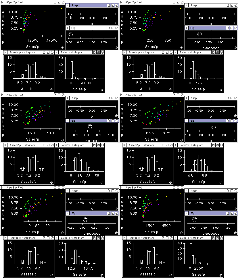
Data Desk uses animation to help you see patterns you migh miss in a static display. For example, you can easily link a sliding control to any part of an equation and see the effects of sliding the value as displays update. Data Desk automatically makes sliders to help you find optimal transformations of variables, to learn about the sensitivity of analyses to small shifts in variables, and to assess the sensitivity of nonlinear regressions. You can easily build your own animations.
The example above selects reexpressions of the variables Assets and Sales for data on large companies. Before transformation the variables are skewed. Moving these slider changes the reexpression of the variables, and the displays update to show the result.
The Data Desk manuals include several examples of interactive analyses. Additional interactive simulation examples can be found on our Templates web page.
|
| DataDeskのTopページに戻る |
|
|

