|
|
|
 |
|
|
データ可視化,データマイニングおよび統計のための高速な直感的ツール
DataDesk
|
|
動的グラフィック表示
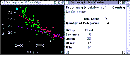
Data Desk's dynamic plots and tables show patterns and structure among several variables. Rotating plots and sliders use animation to reveal aspects of your data that static plots cannot show. Changing the color, symbol and selection state of datapoints instantly changes all plots to show patterns, clusters, and outliers. Hot Set selections restrict displays to subsets of your data with a single click.
In this example, the scatterplot of gas mileage by weight for a sample of automobiles is colored by the number of Cylinders, and a line fit to each colored subset. As different countries are selected by clicking on cells of the frequency table, the scatterplot shows only the selected cars. It is easy to see how the cars from different countries compare.
|
| DataDeskのTopページに戻る |
|
|